Pop-up messages are a great way to boost website conversions and make an emphasis on a certain site’s content. Properly designed element grabs all the user’s attention, which can be used to highlight desirable goods, sales, discounts, feedback requests, subscription forms, etc. Pop-ups aren’t that simple, though. You’ll need some skills to develop an efficient element for your product. It’s hard to create a message box that will be eye-catching, informative and won’t disturb people.
Pop-ups aren’t a marketing panacea. Poor design strategy can harm your conversions, significantly increase the bounce rate and turn the website into an annoying piece of code. In this article, we’ll highlight 5 essential rules you should follow to create an outstanding and functional pop-up design for your website.
Don’t be annoying
Never overdo the usage of such messages. One pop-up per page is a great option, two become a little bit annoying, three or more are a literal disaster. It’s especially disturbing when pop-ups try to show up simultaneously. Don’t be fanatical about pop-ups – in this context more doesn’t mean better. Find out the perfect balance of user convenience and informativeness.
Make sure that your pop-up doesn’t overlap the actual content of the website. A little opacity is a great option to combine the effect from pop-up messages and the actual website appearance. You are free to play around with its style but never to close the visibility of website content completely.
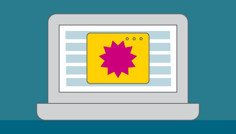
Be eye-catching
Work on the visual appearance of your pop-up boxes. Try to developer original, creative design that will be able to grab all user’s attention. It’s a perfect match to combine memorizable, elegant color scheme, suitable font, and relevant information. Avoid overloading the box with tons of information, dozens of images or a huge variety of colors. Great pop-up tends to be catchy but not pretentious. There’s a fine line between fancy, useful pop-up and annoying message box. In your design, try to figure out the right balance between convenience and appearance.
Use the minimalistic design correctly
Minimalistic design tends to be quite popular nowadays. This approach doesn’t overload user with lots of details or unnecessary information. This kind of pop-up just represents the actual offer in a neutral and elegant visual style. Keep in mind that minimalistic pop-up won’t fit if your website has aggressive, colorful visuals. The message will be hardly noticeable against the style of an actual website.
Take care about mobile users
Mobile devices have lesser computing powers and screen sizes than a desktop computer. Some of the pop-ups won’t fit the screen size, which results in overlapping the website’s content. Others can slow down the device due to their variety of visuals. It’s a great option to develop special small and suitable pop-up for mobile devices. Ensure, that they won’t hide an actual content, will be easy to close and won’t disturb the eye.
Think about timing
Pop-ups must appear at the right time. It’s an awful idea to show them at the very beginning, e.g. when the page has barely finished loading. Catch the perfect moment. For example, in e-commerce stores, it’s a great decision to show pop-up messages with a discount when the user adds a product to a card. The other option is to reward the visitor for a long session time with a coupon or a special offer. In those cases, pop-ups offer pleasant bonuses to a user just at the time he might have thought about it.
The right use of pop-up boxes can boost your website’s profits and conversions. On the other hand, don’t overdo such an approach. Excessive element use, improper visual style, wrong appearance time, messages that don’t fit the context are able to harm user-friendliness and visual appearance of the website. This could lead to a high bounce rate and serious conversion drops.