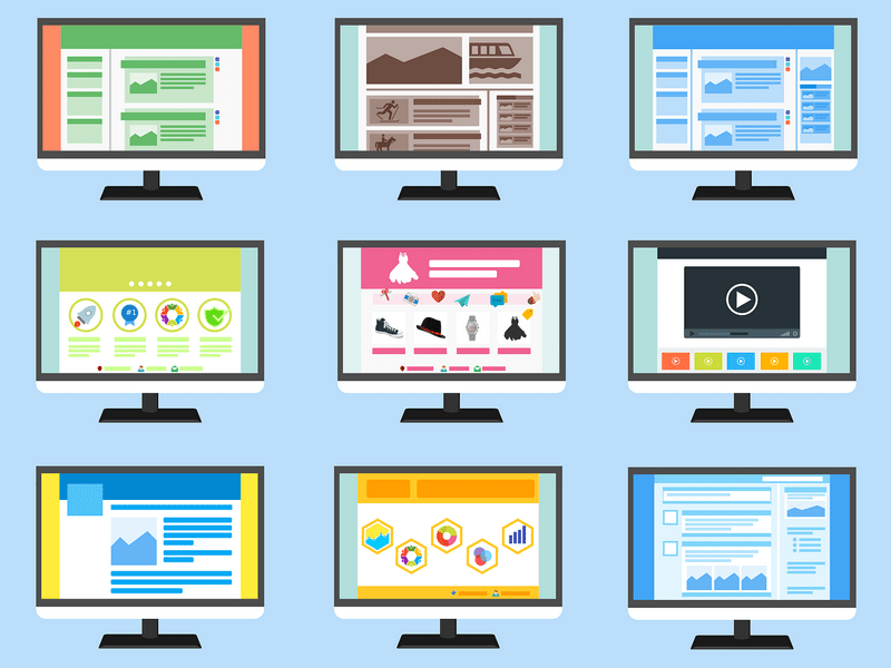
When creating a design, the main priority should be to create a useful and enjoyable interactive experience. Below is a simple list of “do’s” and “don’ts”, which can help beginners understand what needs to be considered when creating their next web design.
Do’s
- Сonsistent interface
The persistence of navigation, color palettes, fonts, and style can have a positive effect on the UX. Therefore, make the design easy to use.
- Simple navigation
Good navigation on your site is vital for visitors to find what they are looking for. Therefore, try using a clear notation for navigation options. Use familiar words in the menu to help users understand them. And also accelerate the time to achieve goals, because navigation should lead users to the right place for the minimum number of clicks.
- Test the design
Web Analytics is a powerful tool that could help you to find sections of the site that need maximum attention. You can also ask one or two users to view your site and share their thoughts to get useful information that cannot be found in another way.
- Minimum number of options
The number of options affects people’s decisions. Namely, the more people have to choose, the fewer actions they take. To increase the chances of interaction, reduce the number of options.
- Make the site responsive
Today, web browsers are available on more than 5 billion devices. This means that users will view your site from a computer, tablet, phone, player, or even their watch. You must make sure that the information will be displayed correctly on screens of different sizes.
- Interesting content for the user
People start to scroll the page immediately after its loading; the upper part of the site is still very important because it creates a first impression and determines user expectations.
Don’ts
- Long loading time
With the advancement of technology, we are becoming more impatient, and today 47% of users expect page loads in two seconds or less. Otherwise, visitors may get annoyed and leave the site.
- Too many colors
It is better not to use too many colors (and too many fonts) in design. It is always better to limit the palette to several colors and maintain its consistency throughout the site. The only exception is when you want to highlight an important section with color.
- Insincere photos of people
Images with people’s faces are one of the effective ways to engage users. When the user sees other people on the site, he begins to feel connected with them, as if he is communicating with them, and not just using the product. However, very often many sites use insincere photos to create trust. As a rule, insincere photos rarely help the design.
- Too much advertising
Too many advertisements on a page can divert attention from the main content and make it harder for users to achieve a goal. Moreover, users usually ignore everything that looks like advertising.
- Flashing text or advertising
Flashing and flickering can trigger seizures in some people and will annoy others.
- Automatic pop-ups
Many sites show a window requesting a subscription immediately upon entering the page. This is one of the most annoying things for a site visitor. By themselves, pop-up windows interrupt the interaction and are usually used for advertising, so users often close them without even reading the content.
Conclusion
When interacting with sites and applications, people expect a great user experience. If you cannot meet their needs, they will go to your competitors. When making any design decisions, you should think about what is best for visitors.


