
How important is the contact us page to the overall attractiveness of the site? Depending on the purpose of the resource, you are probably thinking about its home page, perhaps a blog, product pages, animated effects, usability, etc. We bet you are not thinking about the “Contact Us” page on your future website.
Unfortunately, very often contact pages end up at the very bottom of the list of priorities, both in terms of copywriting and layout for many designers. How often have you come across contact pages that look as attractive as the rest of the website?
Failure to monitor the attractiveness of this aspect can cost the site owner a significant drop in conversion rates. In fact, the Contact Us page is one of the four most important pages on any website because it is usually one of the most visited pages on the site for most companies.
Wondering What an Ideal Contact Us Page Should Look Like?
What makes a great Contact Us page? You know, the question of the Contact Us page attractiveness is very personal. What we mean is that what is good for you may seem bad or even ugly to others.
It is better to take into account not your personal taste and preferences, but user experience. Remember, a good Contact Us page should state the following:
- It should be placed where the user will understand why he is filling it in.
- You must place the link to your Contact Us page in a prominent (expected) place on the website so that users can easily find it.
It goes without saying that your Contact Us page should be clean and the design should reflect the visual identity of your brand. In fact, there are many ways to enable your customers to connect with you. But it’s important to remember that your customers are now expecting more from their virtual experiences than ever before. There are so many other resources out there that know how to attract them. This is why how you communicate with users is so important. You need to constantly evolve and meet their highest expectations by being available anywhere, anytime.
The Main Functions of the Contact Form

Typically, the best contact pages serve specific functions:
- They explain why a visitor should contact you and describe how you can help solve visitor problems.
- They include an email address and phone number so that visitors can quickly find the information they need.
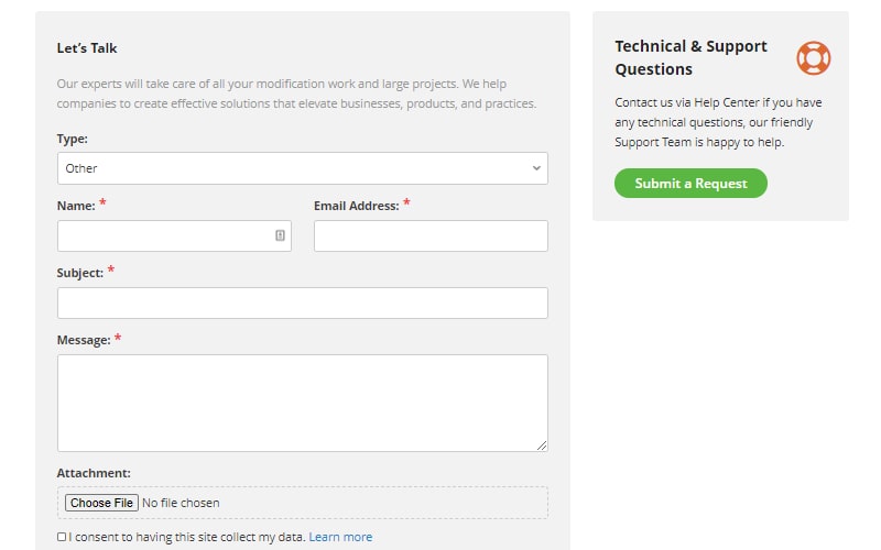
- They include a short fill-in form to help you understand who is contacting you.
- They include a call-to-action to get people to stay on your website and give them another option if they don’t want to fill out even a simple form.
- They demonstrate the main ideas of the company. This can be done by including a list of recent blog posts or press articles about the company.
- They are linked to your active corporate social media accounts such as Twitter, Facebook, Instagram, and LinkedIn so that visitors can participate in your business.
- They redirect the user to a “Thank you” page that explains when and how you will contact them.
- They give your visitors an easy way to send you a message right from your website.
Companies that have implemented advanced, thoughtful marketing strategies are taking an excellent approach known as opening up communication channels that meet the new standards customers expect. This is an omnichannel communication approach. With modern technology, you can communicate with customers via chat, messages, text, voice, Messenger, Whatsapp, Viber, etc. Also, one of the functions of the contact page is to show that you are glad for every new client and want to have a connection with them and are aimed at long-term cooperation.
This is not only convenient for customers but can also have a positive effect on conversion rates. Such a variety of communication channels is invaluable for any business owner. Never underestimate the value of having all your communication channels in one place. Convenience is a guarantee of the buyer, and a happy buyer turns into a loyal one.
Attractive and Effective Contact Page Tips
The conversion greatly depends on call-to-action. Have you ever noticed that most of the small business websites don’t contain a CTA at all, while it can boost your conversion, by motivating people to contact you and doesn’t let them go to your competitors?
Many companies fail today because they design contact forms incorrectly or don’t use them. If it’s at the top of your funnel, you can attract as many leads as possible. That means not many form fields are needed for creation. You can nurture them to a sale through email afterward.
If it’s in the middle of the funnel, you need to explain to the visitor why your product or service is the best option for solving their problem. Typical content isn’t limited to webinars, case studies, free samples, etc. If it’s at the bottom of the funnel – this is the buying stage. Here, the prospective buyers know what they want, have evaluated all options, and are ready to buy. These contact forms are longer because companies need as much reliable information as possible to close a deal.
An average online marketing website usually uses three mandatory and two optional fields:
- Name is a mandatory field
- Email is a mandatory field
- The phone is a mandatory field
- The city is an optional field
- The state is an optional field
But as you understand ‘city’ and ‘state’ fields would also be mandatory for product delivery. The fact is that there is no perfect formula for the number of form fields or how many fields should be mandatory and optional. It all depends on you and your clients. Just always follow the strategy that will help you to grow your business when you choose the fields and their number.
Conclusion
So there you have it a list of tips on how to create some of the best Contact Us pages. Take a look at your company’s contact page and see how it stacks up and if there are any customizations you can make to make your website visitors better, easier, and more enjoyable.
Now that we have figured out what we need to create an attractive page, you need to decide what your company needs on this page, what information to place there, and, of course, add a form there to collect user data. That is why we suggest using the Contact Form plugin by BestWebSoft to create a form that will increase the conversion of your site. Our plugin provides flexible settings and existing functionality.
In conclusion, I would like to note that your site or service is always a way to promote your product, whatever it may be, therefore, for you, as for us, every little thing is important, and it is important to make your product, service or something. It is even more attractive, high quality, and more modern because, in such a difficult time as a pandemic, this is one of the best ways to be on top.